Understanding Colour Theory
Have you ever wondered why you’re exceptionally drawn to certain designs and patterns, and you can’t stop staring at the colours as they seem to draw you in? That’s colour theory at work, creating a pleasant effect and attracting your attention.
WHAT IS COLOUR THEORY
Colour theory is the science and art of using colours to create a certain effect and invoke a certain feeling. Colour theory explains how the human brain perceive colour, how does colours convey messages and the visual effects of how colors mix, match or contrast with each other.
WHY IS COLOUR THEORY IMPORTANT
Understanding basic colour theory is useful for your artistic journey because it helps you develop a spidey sense about what kind of colours can or cannot work together, and it is especially important for colour mixing, so that you do not get muddy colours. This knowledge will help you create beautiful art in pleasant cohesive colours that attracts attention.
COLOUR THEORY AND COLOUR WHEEL
The color wheel was invented in 1666 by Isaac Newton, who mapped the color spectrum onto a circle. The color wheel is the basis of color theory, because it shows the relationship between colors. Colors that look good together are called a colour harmony. In this blog post, I am going to talk about the colours wheel and colour harmony.
By the end of this, you will_
1. Know what are your primary, secondary and tertiary colours
2. Have a basic understanding of colour harmony and why it matters
WARM COLOURS AND COOL COLOURS

PRIMARY, SECONDARY AND TERTIARY COLOURS
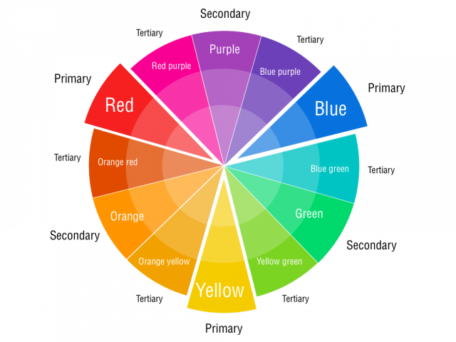
Primary Colors: Red, yellow and blue
In traditional color theory (used in paint and pigments), primary colors are the 3 pigment colors that cannot be mixed or formed by any combination of other colors. All other colors are derived from these 3 hues.
Secondary Colors: Green, orange and purple
These are the colors formed by mixing the primary colors.
Tertiary Colors_ Yellow-orange, red-orange, red-purple, blue-purple, blue-green & yellow-green
These are the colors formed by mixing a primary and a secondary color. That's why the hue is a two word name, such as blue-green, red-violet, and yellow-orange.
ANALOGOUS COLOUR

Analagous colours are three colors that are side by side on the color wheel. These colours are similar in hue and are often found in nature, hence it is more harmonious. However, this also means that the colours are intense so I like to pick a dominant colour and use the other two in a lighter hue so as to soften the overall look and the effect on the eyes.
COMPLEMENTARY COLOURS
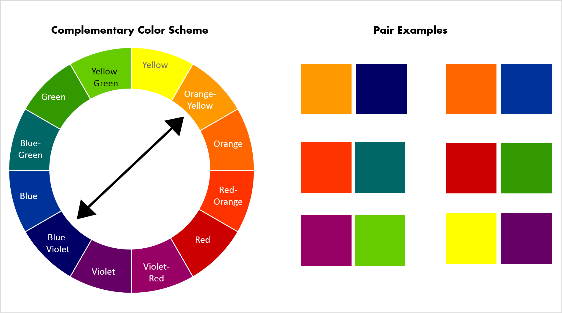
Complementary colours are opposite each other on the colour wheel. These colours are highly contrasting, hence it appears brighter and more vibrant.
MONOCHROMATIC COLOURS

Monochromatic colours are all the single colours - tones, tints and shades of a single hue. Monochromatic colours are easy on the eyes because they use only one colour in multiple light and dark values.
SHADE, TINT, TONE, HUE AND VALUE
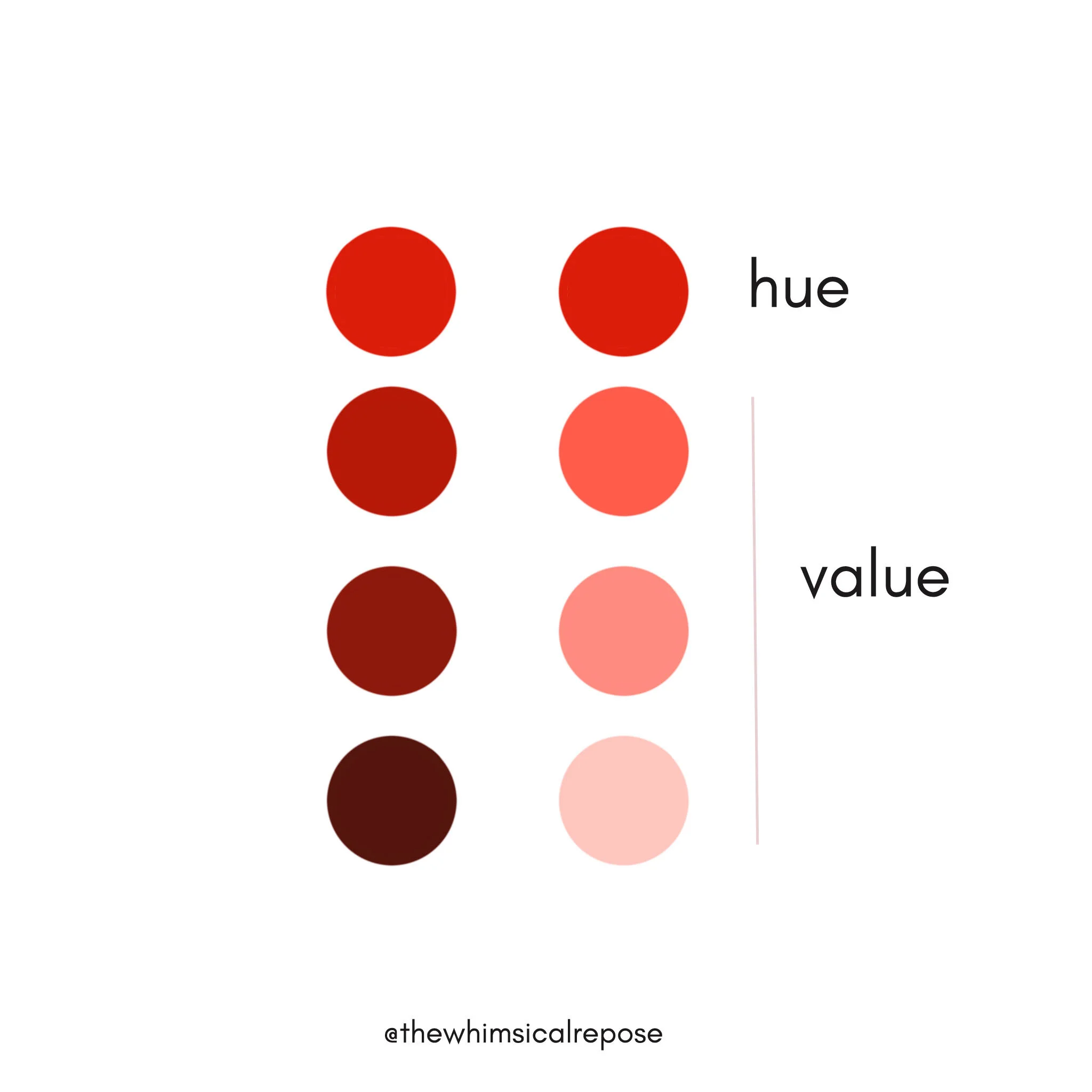
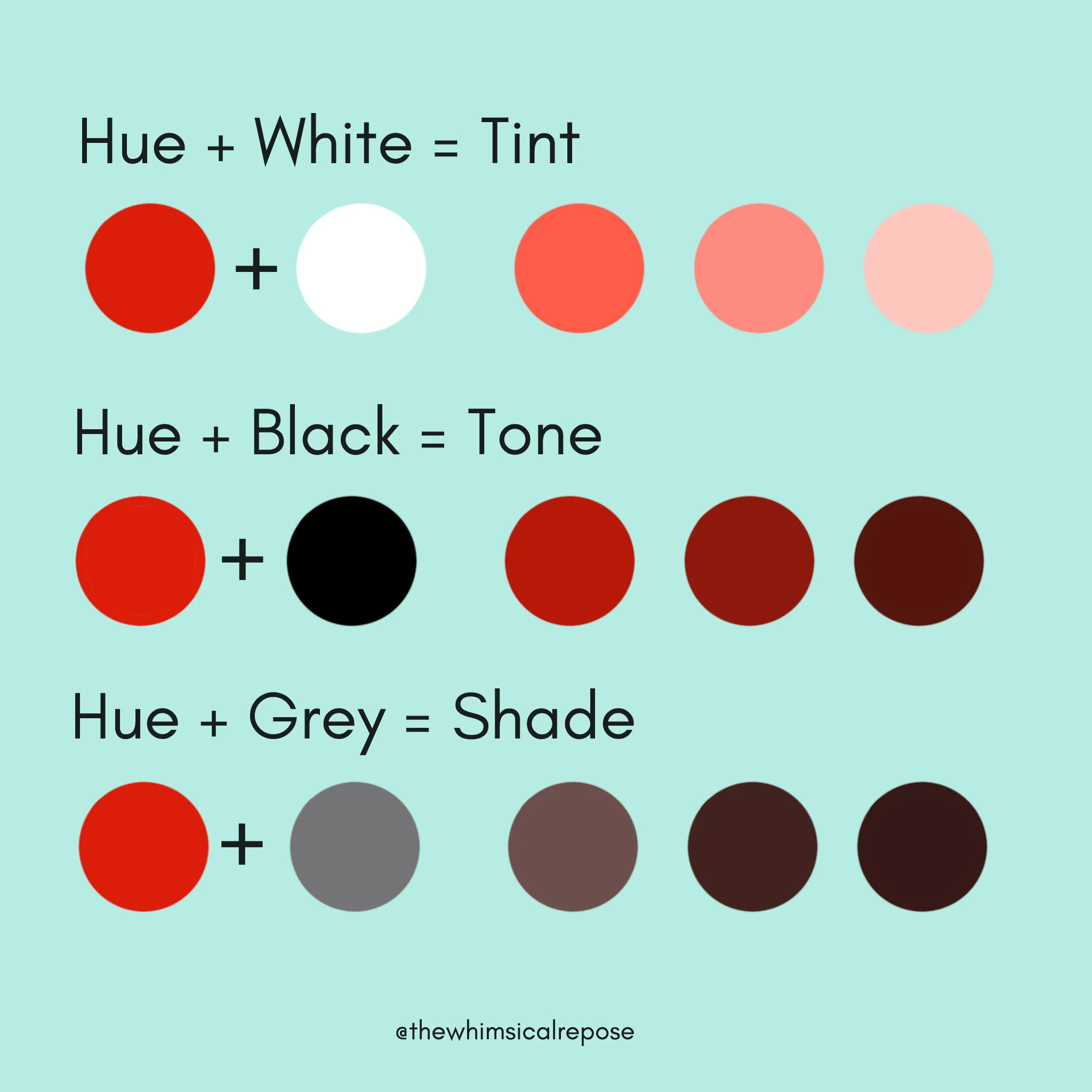
Tint is adding white to a hue and making it lighter in value. Eg_ red + white = pink
Shade is adding black to a hue and making it darker in value. Eg_ red + black = dark red
Tone is created by adding both white and black to a hue.
HOW TO USE A COLOUR WHEEL
Once you recognize that colour has a temperature, you will have a better understanding of how to pair colours for your painting, and how choosing all warm or all cool colors can affect the overall mood of the piece. Use the colour wheel as a reference point to guide you in your colour choices. Test out different combos, paint swatches side by side and see how they feel together.